|
|
||||||||
About
the Press
From
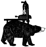
a drawing
by Louis Turpin
The Press
A few words about Barbarian Press
By Crispin and Jan Elsted
We founded Barbarian Press in Boughton Monchelsea, Kent, in 1977, having conceived a love for beautifully printed books and a determination to see what we could do ourselves in that line. We were trained in letterpress printing by Graham Williams at the Florin Press, and in 1978 we returned to Canada with presses and type and established the press on five wooded acres in Steelhead, British Columbia, near Mission, about 50 miles east of Vancouver in the Fraser Valley.
Initially the press occupied an old shed on the property, but in 1988 leaking roofs, collapsing floors and overcrowding forced a change, and the barn was converted into a 1,000 square foot shop containing a pressroom and composing room, with an additional wing off the side which was initially intended to be used for casting type. That plan never really took root, and in 1996 we acquired a hand bindery and housed it there.

Pressroom in snow, circa 2005
The first book bound in-house was the 1996 publication Rufinus: The Complete Poems, which won an Alcuin Society Citation for Excellence in Book Design in Canada. Inishbream, a novella by Theresa Kishkan with wood engravings by John DePol, was published in 1999, and the binding of the regular and deluxe states of that edition were both carried out at the press under the direction of the award-winning Québecois binder Hélène Francœur. Other titles, among them 21 Small Songs, Gallipoli, Between Rainfalls, the portfolio Under Strange Sail, and the components of The Seasons have also been produced here, but nearly all our binding – anything beyond simple sewn pamphlets and chapbooks – is now done by Alanna Simenson at The Mad Hatter Bookbinding Company in Sooke, B.C., although the bindings are still designed by Crispin. The ‘bindery’, as we continue to call it, now houses an eight-foot storage rack for paper, two large frames of type, a large map case, a stamping press, and three long work benches (one with a glass top) for folding and collating sheets, packing books, and other associated tasks.
Barbarian Press is a full-time operation for both of us. Publication decisions are shared, but generally the design, typesetting, and any necessary editing are done by Crispin, and the presswork by Jan and (since 2020) our daughter Apollonia. Initially the type for the books was entirely set by hand, as most of it still is, but in the last few years we have occasionally bought in composition as a means of increasing our holdings of type.
Barbarian Press remains an entirely letterpress shop. Our nine presses include three 19th century handpresses – a super royal Albion (1850), a foolscap folio Barrett Albion (1833), and a foolscap folio Sherwin & Cope Imperial (1854) – Vandercook Universal One and Universal III horizontal cylinder proof presses, a Red Ball Heidelberg Windmill, a 12 by 8 Craftsman press, and the two Adana 8 by 5 tabletop presses with which we began the press, and which we still use for labels, cards, and envelopes on occasion. The range of typefaces at the press includes a number of favoured text faces – Bembo, Joanna, Poliphilus & Blado, Van Dijck, Monotype Garamond (156), ATF Garamont, Octavian, Walbaum, Bell, Pastonchi, and Cancelleresca Bastarda – and a large and growing collection of titling and display faces. The press also holds a significant collection of type flowers and ornaments, notably including the entire Monotype ornament collection of the Curwen Press.
Our aims have not substantially altered since we founded the press: to publish poetry, translations, classics, and belles lettres in a style which both glorifies the text and reveals it to the reader with a minimum of interference. To these, very soon after establishing the press, we added an important interest in wood engraving, which began in 1984 with our commissioning Edwina Ellis to illustrate A Christmas Carol, or, The Miser’s Warning, a pirated play based on Dickens’ story and first produced in 1844. This was followed by a companion volume of The Chimes in a dramatic form approved by Dickens, and in 1995 we published Endgrain: Contemporary Wood Engraving in North America, a survey of 121 engravers, which Simon Brett called ‘a major achievement, a milestone in the documentation of wood engraving’.
Most of the press’s books now include commissioned wood engraved illustrations, and in May 2000 there appeared the first in an ongoing occasional series of Endgrain Editions, each devoted to the work of a single engraver. This has now reached five volumes, with others planned.
Over the years Barbarian Press also acquired a reputation as a teaching press, reflecting our determination to help keep the crafts of hand-setting and printing alive and to pass them on. A number of people have worked with us as apprentice/interns for varying periods of time. Every June for some years, under the auspices of the Canadian Bookbinders and Book Artists Guild, we offered a six-day intensive workshop at the press, introducing participants to the basics of letterpress design and printing, salted with talks on the history of the book and informal discussions of book design and printing. Unfortunately the pressures of work and age have forced us to stop this, although we sometimes have people come to the press for informal workshops of a few days, or to work with us regularly one or two days at a time over a period of weeks. Several of these participants have gone on to set up their own presses, or to develop the work they were already embarked upon as binders or papermakers in the direction of printing and publishing. This dissemination of experience and interest continues to be important to us, and we continue to encourage it and help as much as we can.
The most important development in recent years has been our daughter Apollonia’s joining us to work part-time at the press, to our great joy. She is a superb craftswoman, with a searching eye for detail and immaculate taste. She had been working for some years in a commercial letterpress shop in Vancouver and has become an adept press operator on a Heidelberg Windmill press, so when our old friend David Clifford closed his Black Stone Press we were able to go together to purchase one of his immaculately maintained Windmills and install it here. Apollonia has now added swift and accurate hand-setting to her skills, and as we have unavoidably begun to slow down somewhat, she is able to gather the slack and help us continue with our many and varied projects. All this has been made the more practicable by her having moved onto the property here with her partner Andrew in 2019.
Since the autumn of 2024 we have been joined on a regular part-time basis by Lea Sánchez Milde, who worked with Apollonia in Vancouver and is also an accomplished printer and compositor. Lea helps in all areas of the press’s work, but will be especially involved in the production of pamphlets and chapbooks. As well as becoming a member of the Barbarian 'family', she is our grandson Michael’s godmother.
In the last few years we have reconciled ourselves to the idea that it is possible to embrace digital type for some small projects without selling our souls to the devil. We are learning to use a program for book design recommended by several colleagues, and we will buy in digital fonts of typefaces we already use regularly at the press, especially Bembo, Poliphilus/Blado, and Joanna, so that the work we produce this way will fit idiomatically into our list. Later, of course, we can add other faces as we choose – an exciting prospect. As this will mean using photopolymer plates for printing on occasion, we have added a platemaker to the press's equipment to create the plates from digital files, and we will use this initially for the chapbook series on short stories [Well Told Tales] and perhaps for some ephemera. The platemaker will also make it possible to commission and reproduce line drawings from artists, thus introducing a new medium of illustration into our work.
A final word on the style and intentions of the press seems important. While we don’t, by any means, eschew light experimental touches – non-adhesive bindings, mono-printed cover papers and so on – the press’s style is relatively conservative. Unlike those of many printers of fine books, our backgrounds are in literary studies and writing rather than graphic and studio arts, and we make our books to be read, not merely looked at. We feel that nothing should come between the text and the reader, and it is our view that typography should have, in Robert Bringhurst’s phrase, ‘a statuesque transparency’: like good film music, the best typography is effective to the degree that it is unobtrusive – supporting, not supplanting, the principal experience of the reader. Private press printing is a craft, not an art. The design and making of beautiful books is only secondarily a matter of self-expression; its first excellence is to serve the author and the reader.