|
|
||||||||
Press
Update:
September 2015
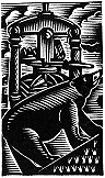
Wood engraving by John DePol
(from Utile Dulci: The First Decade at Barbarian
Press, 1992)
Other pages of Press News can be selected from the menu below.
Press News: September 2015
We begin with housecleaning, and its consequences. Some people say that cleanliness is next to godliness – which makes us wonder why we rarely hear of ‘grey-collar crime.’ But it is certain that in a printing office orderliness is next to survival. Over many years the shelves which form the divide in our pressroom between the composing area where I set the type and the section where Jan does the presswork had become something resembling an archeological site. There were cardboard cartons with fading labels, wrapped packets of paper (some printed and some not), stacks of card stock, offcuts from the guillotine which stands at the end of the shelves, and various small and interesting boxes which, when opened, revealed little mysteries: seven bookmarks and a Christmas card in one, a bag of rubber bands in another, and several pieces of wood type in a third. (This is rather akin to discovering a populated mouse nest in a type case, which happens to us more often than perhaps you might think.) After making a particularly desperate attempt one day to find something which had gone missing, we decided it was time to sort things out.
The shelves were just the beginning, of course. We had also let the large map cases in the bindery reach a state of baroque chaos. These twelve enormous flat drawers were intended to allow safe storage for large broadsheets, special papers, prints, ephemera, and art work. Over time they had become the place in which anything too large to fit safely on the shelves or in the paper racks had been ‘temporarily’ housed until a better place could be found. After fifteen years or so of temporary storage, it had become impossible to find anything in any drawer without removing its entire contents. Accordingly, one of us might occasionally be seen standing like an inept laundress, multiple sheets of large paper draped over one arm, the other arm fishing forlornly about in the dark recesses of the partially emptied drawer, making small clucking sounds and trying to think of someone else to blame.
As always in such straits, one turns to classical wisdom. Periculum in mora: There is danger in delay. I took the map drawers; Jan took the shelves.
The results were exhilarating and surprising. On the shelves, Jan found things we could barely remember having printed (and some things we devoutly wished we had not) many going back to the earliest days of the press. In the drawers I began by seeking out the many proofs of engravings from scores of engravers all over the world which we knew were there – although we could never be sure just where any one of them might be. The assumption, which to our astonishment turned out to be reasonable, was that in discovering the smallest items, the large ones would necessarily be revealed. After winkling the engravings out and sorting the larger materials into drawers, properly labelled, I arranged the proofs in a series of albums so that we could enjoy them in safety – for us as well as them.
Jan was in the meantime having an equally good time. Various packets of paper, separately wrapped, turned out to be the same paper with the same dimensions, and these were consolidated. Nondescript looking envelopes were discovered to contain sheets from long-forgotten pamphlets which, as it turned out, allowed us to assemble two or three copies of some things we had thought long gone. I was gleefully confronted with one of the worst business cards ever perpetrated on an unsuspecting (and thankfully typographically uninformed) client, whose design I was sadly unable to deny as mine. (I have kept it as a memento mori.)
When we began to print we didn’t begin at once to produce books; had we done so, the results would have been catastrophic. Our first two or three years were predominantly spent on ‘jobbing’ – printing for hire. Any selection of the jobbing work, or commercial printing, which we produced in those years would include everything from invitations and gallery announcements to business cards, letterhead, wedding invitations, menus, birth announcements, & much else. The collection we winnowed from the chaff of the shelves is not complete, but it is substantial. This ‘Spring cleaning,’ born of frustration, has allowed us to assemble examples of press ephemera and create a file of printing – other than books and pamphlets – we have done over more than 35 years. At this distance, and with the Olympian detachment we can now muster about our own work after so long a time, it gives a good survey of our progress in learning how to use and combine types, and how to print the results.
Among these ephemeral pieces are a number of broadsheets, some printed by us to celebrate birthdays or visits by friends, others commissioned by clients to mark births, marriages, or other significant occasions (there are one or two large menus), and a few others published as literary offerings to be sold at fairs or given as gifts. Many of these were unhappily printed on Japanese kozo paper, flecked with leaf inclusions, cheap and (as we thought at the time) rustically artistic. We hadn’t realized then that, owing to the amount of vegetal matter in the paper, it also foxes with a suicidal abandon, so that few copies of some of these pieces are salvageable at all.
Another group comprises folding cards and pamphlets. We produced a number of Christmas cards for sale between 1977 and 1981, most of them on long unobtainable Barcham Green hand-made papers. It is rather heartbreaking to see them now, when we think how else we might have used that paper. Occasionally we have printed Christmas cards or greetings to send to our friends and subscribers, but, like the cobbler’s shoeless children, printers rarely have their own cards to send out. There are also some small pamphlets printed from the press on various subjects, as well as folded and sewn invitations and menus for special occasions – a dinner at the Double Crown Club, or an exhibitors’ banquet at the Oxford Fine Press Book Fair.
Finally, there is a sizable collection of bookmarks, some generic, others for bookstores, including a large number printed for Duthie Books, a wonderful family-owned chain which kept Vancouver literate (or nearly so) from 1958 until they were finally trampled underfoot by Kindle-illiteracy and the big box bookstores just after their 50th anniversary. We often used to print Duthie’s bookmarks at Christmas and occasionally at other times, and through many a long night we would turn out as many as 75,000 bookmarks on ‘Bess,’ the elderly (1907) Gordon/Chandler & Price press on which we also printed some of our early books. We printed the bookmarks ‘four-up,’ sometimes in two colours, and then cut them on our ancient guillotine. We were younger then.
These many hundred items are now sorted and wrapped, and the comfortable muddle of the past has been transmuted into regimented ranks, but at least we now have an idea of what we have. The question of what we might do with all this we are, as is our habit, putting aside for the time being.
The Ingoldsby Legends
The Ingoldsby Legends: a Gallimaufry, published in the summer, took us much longer than we had thought. The production of The Seasons: Four Bagatelles delayed it somewhat, but the principal hold-up was my having to have urgent surgery in the winter – on New Year’s Eve, in fact, which meant I hadn’t to devise excuses to refuse party invitations – for an aneurysm in my left leg. This went well: I still have the leg and, to date, no other aneurysms. Recuperation took rather longer than we had thought, and although I was able to develop a deeper knowledge of Wagner’s Ring cycle and Bruckner’s symphonies, both great pleasures, and to catch up on some reading, I chafed at being unable to work at the press for more than six weeks. I am now walking with a cane, which I like to think adds a certain distinction, and am in the market for a stout walking stick which is long enough for my height (six foot three inches) and has a comfortable handle and a concealed flask in it for Scotch. But back to Ingoldsby.
With the eight engravings loaned to us by the Robertson Davies Library at Massey College, and eight poems to print, it didn’t seem to us at the outset that Ingoldsby would be more than a medium-sized book. Only eight of the engravings were illustrations; the ninth was an engraved title for the edition for which the illustrations had been prepared in 1870, but which had never appeared. We also included two of the Ingoldsby poems – ‘The Jackdaw of Rheims’ and ‘The Legend of Hamilton Tighe’ – for which there were no illustrations, because they were favourite bedtime readings when I was a child. For Jan they were a new delight.
Once the seven engravings had been matched to their poems and while the hand-setting of the type was under way, I began to compile the notes. The poems make many topical political and theological references, some now quite unfathomable without considerable digging, so it had been clear from the outset that notes would be needed. I plunged gleefully into this while Jan got on with printing the engravings.
The notes became quite extensive. The tag-ends and oddities of Victorian social, political, and religious history which they cover are fascinating, and certainly help to an understanding of the poems. Richard Barham wrote the Legends under the pseudonym of Sir Thomas Ingoldsby (hence the title, and our not showing Barham’s name on title page) so I also wrote an Afterword about Barham himself and the ethos from which he and the his writings emerged. All in all, once the poems, notes, and Afterword were set, the book came to about 170 pages, greatly to our surprise. It may be the longest hand-set text we have ever published, followed closely by Pericles and Hoi Barbaroi and at some distance by Inishbream.
The Barbarians in Dawson City
About a year ago we were invited by the organizers of the annual Yukon Riverside Arts Festival in Dawson City, Yukon, to take part in a Printing and Publishing Symposium as a part of the Discovery Day weekend this August. The brief was quite open-ended: we were asked to give one formal workshop or demonstration and to provide one other event, such as a talk, a seminar, or an exhibition. The invitation and the responses to our following questions were casual and enthusiastic, but not always as detailed as they might have been, and as the time to go drew nearer we were little the wiser about some basic things: Where were we to stay? What equipment would we have available? What might they like us to print? and so on.
Fortunately our good friend Peter Braune, proprietor of New Leaf Editions on Granville Island in Vancouver, a gifted printer of lithographs, etchings, and screen prints for many artists, had been to Dawson for an earlier festival, and was invited this year as well. Peter is one of those people who, deserted in a wilderness of stone with nothing but an art eraser, a broken mousetrap, and two nails, would have built a house and started a business in it within a week. He would also have attracted a clientele. Peter was able to describe what we would find in Dawson, and he assured us that on his last visit, when he had discovered that the printing press available had no chase (the iron frame in which one locks up the type or other material to be printed – an absolutely essential piece of equipment) he had borrowed someone’s carpentry shop and made a wooden one specifically for the press. It is still the only chase in town, and it worked perfectly. Peter’s presence and that of another friend, Joyce Majiski, an artist, biologist, and wilderness guide living in Whitehorse who had taken a workshop with us at the press about ten years before, allowed us to breathe more easily.
And of course, as we should have known, everything was fine. More than fine, in fact: everything was delightful. But first, an advertisement: we must say that Air North, which only flies to the Yukon, is the friendliest and most accommodating airline we have ever travelled with – and they serve warm chocolate chip cookies! (A word to the wise.) But on to Dawson.
Dawson City was a gold rush town: when gold was discovered there in 1896 the word spread, and by 1898 what had been a small camp of a few people had become a town with over five hundred buildings (a significant proportion of which were saloons) and a population in the region of 40,000. A year later, with the gold apparently exhausted, the population dropped to 8,000, and now it hovers around 1,500.

The weather in August was pleasantly cool in contrast to the blazing temperatures we had been experiencing in the lower mainland of British Columbia this year, and the town, nestled at the confluence of the Klondike and Yukon Rivers, is picturesque and homelike.
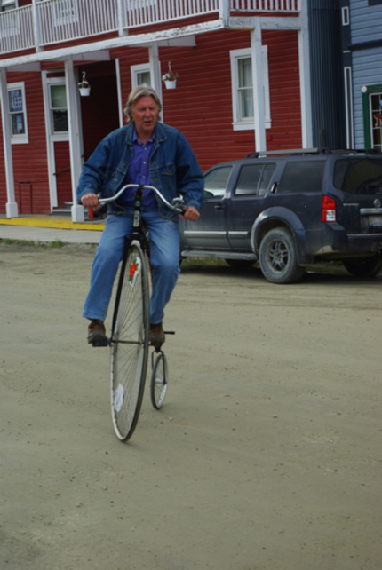
We stayed with Karen Bubois and Eldo Enns. Karen, who runs KIAC, the Klondike Institute of Art and Culture, which organizes the festival, was the perfect hostess/chatelaine, combining warmth and efficiency with a complete inability to be disconcerted by setbacks, and Eldo runs the Tourist Office, occasionally riding the few blocks to work on a penny-farthing bicycle which he keeps on the front porch. They are a wonderful couple, warmly welcoming and full of stories about Dawson. In fact, everyone we met in the town had stories to tell, and like many small towns there is a quirky individuality which is endearing and endlessly entertaining.
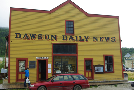
The building in which we worked was the original newspaper office for the Dawson Daily News, where the editorial work, the writing, and the printing of the paper was done from 1899 (when it was one of twelve papers printed in Dawson) to 1954 when, as the sole surviving sheet, the paper folded.
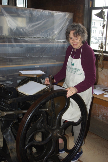
Inside, the building was essentially raw timber and posts, with the original newspaper press still there, although it is untended and slowly deteriorating. There is some hope that this press and some other original equipment will be restored, but at the moment, with a federal government completely uninterested in history or heritage, there is no funding available. The one press which was working had in fact been moved there from the Whitehorse Star, another defunct Yukon paper: a Chandler & Price vertical platen press which Peter had restored from a rusted hulk, and for which he had created the famous wooden chase. Jan spent three days printing on it, powering it by means of the treadle with which these presses were all originally provided – one foot power. By the end of the weekend her thighs were as muscled as a marathoner’s. She couldn’t walk, but she had muscle tone a-plenty. In the meantime, I became the ‘barker’ or front-man, explaining to the public who came in how the press worked, and telling them something about the history of the craft of printing. I also took part in two colloquia concerning the place of the book in contemporary publishing, and the routes to publishing for emerging writers today.
It being August and high summer, only a couple of hours in the twenty-four were dark: the sun set at about 1am, which meant that people stayed up late and the atmosphere in town was lively. One night at about 3 o’clock we were treated to a spirited discussion of the relative merits of philosophy and gunfire in carrying one’s political points in discussions of the upcoming election. It wasn’t clear which argument carried the day, as it was perambulatory, and the debaters turned a corner during final rebuttals. Parades also play a large part in Dawson’s activities. We missed the annual Outhouse Race – Eldo’s team, the Old Farts, won the red plunger award for coming in last – but saw the Discovery Day parade, with its many floats. There were bands on flatbed trucks playing everything from Celtic pop to rock and fiddle tunes; a model of the Chilcoot pass with one man, dressed as a pioneer, carrying a miniature piano on his back as he struggled up a mountain made of bales of straw covered with sheets; a gaggle of what must have been every child under ten in Dawson riding bicycles almost completely hidden by balloons; and a farting, gassy, shunting snarl of immense, overpowered, deafening trucks, whose entire purpose was to take part in a contest later in the day to see who could drive through a deep pond of thick mud, created by the fire brigade for the occasion, without getting stuck. (I suppose all the library books must have been out on loan. After all, one must do something to pass the time.)
‘One of the traditional annual events,’ Eldo told us, ‘is the Christmas boat parade.’ This announcement was met by a thoughtful silence as we worked this out. Of course. The river is frozen at Christmas, so since one can’t float a boat, the sensible thing is to put all of them on trailers, decorate them, and parade through town to the applause of the remaining citizenry. And why not?
We hope to go back to Dawson one day. There are some accomplished artists and craftspeople there, and much history to be explored. More than that, there is a mixture of whimsy and determined accomplishment, combined with a friendliness and kindness which is utterly beguiling. We recommend it highly.
Curwen Research in Edmonton
In March, I set off to Edmonton to do some necessary research for our long-planned and now imminently commencing book on the Curwen Press, Bordering on the Sublime. The Bruce Peel Special Collections at the University of Alberta has a significant collection of Curwen Press ephemera, largely acquired from an enthusiast who had filled many enormous scrapbooks with Curwen material over the years.
The contents of the Curwen book, in general terms, are clear enough: there will be lengthy essays by David Jury and me about the history of the press and its place in the context of British and European design, and of course the raison d’être of the book – the hundred or more borders, mostly in two colours, composed in printer’s ornaments by Bert Smith. However, the nature of a border is that it contain something, and indeed the Curwen borders were used by the press to contain all sorts of things: menus, invitations, certificates, public health warnings, concert programmes, and advertisements, to name only a few. It will be necessary to print some texts inside the borders when they are shown in the book, for a long train of empty borders would very soon appear to be merely one damn thing after another, and would lose their effect. Understandably, a border is seen at its best and admired most when it surrounds something.
When we acquired these borders and ornaments from the Curwen collection, we bought with them a large number of proofs of ephemeral pieces showing these borders in use. We nevertheless thought that a wider range of possible texts for them would be useful, and it was in quest of these that I made the trek to Edmonton. The staff at the Bruce Peel Library, led by the Head of Special Collections, Robert Desmarais, were wonderful. The entire holdings of Curwen ephemera were waiting for me in one of the reading rooms, and I spent the better part of three days there taking hundreds of pictures. Many of them were duplicates of what we already had, but there was much else which was completely new to us, among the most interesting of which were the public service announcements printed during the war about rationing and matters of safety. Ephemeral printing like this provides telling insights into the social history of its time as well as the manners and styles which were current when it was printed.
While I was there, I also gave a poetry reading, delivered a public lecture on the nature of private press publishing, and taught two classes in the Fine Arts and Design and the Librarianship programs.
In mid-March the temperature in Edmonton was tolerably cool. In fact, not to put too fine a point on it, it was bloody cold. The Bed and Breakfast where I was staying was a few long blocks from the University library, and walking there in the morning into a stiff (or perhaps I should say ‘stiffening’) wind was a Spartan undertaking. The hosts of the B&B were a delightful couple whose ‘extended Continental’ breakfasts involved fresh baking, fresh fruit, cheese, and lashings of muscular tea which soon banished my wistful hankerings after bacon and eggs. On three evenings there were dinners at two excellent restaurants (the Upper Crust Café and the High Level Diner – advt.) hosted by Robert Desmarais, with whom I had a chance to talk at length and forge the start of a fine friendship, and with Sue Colberg, who is the head of the Fine Arts and Design program, and now also a firm friend. On the evening of the public lecture I was taken to dinner by one of our subscribers, Ingrid Dandanell, whom we had never met, and who clearly understood what draining work long hours in a library and public speaking can be, because she began as soon as we sat down by ordering large scotches and followed those with two bottles of excellent wine. The conversation was branching and delightful. One of the most pleasurable and rewarding parts of the work we do is the opportunity we have on such trips to meet people to whom we have talked on the phone and written for many years. Ingrid is a delight, and the evening was memorable.
A special happiness of the trip was a visit of a few days with my daughter Rowan and her partner Jasmine in Falun, a very small farming community south of Edmonton. We have not nearly enough time together, and it was truly a joy, after several days of concentrated work, to be able to relax with them in their warm, loving home surrounded by the crisp, austerely beautiful Alberta late winter countryside. There are some blessings which are unimaginably fine.
Fancy: 8 Odes of John Keats
Bordering on the Sublime, our book on the Curwen Press borders, is going into the press late this autumn, and we expect production will take about a year. This means that in order to eat and pay bills, we must produce some smaller projects while it is being printed, and Fancy: 8 Odes of John Keats, is the first of these.
A gratifying number of you (as well as many others outside the press fold) have said over the years how much you have enjoyed our edition of Keats’ The Eve of St. Agnes, published in 2003. It is also one of our favourites, partly because of its compact format, but largely of course because of Keats’ poem & Andy English’s superb engravings. After the prolonged gestations of Ingoldsby, Endgrain Editions Four, and Pericles, we had been wanting to find a project which we could produce fairly quickly, and it happened that within a brief period we heard three or four comments from people in e.mails or in conversation about our Eve of St. Agnes. Since we have plenty of suitable paper in stock, cut to the right size, the idea of printing Keats’ five ‘Great Odes’ as a companion volume to Eve rather fell into our laps.
We wrote to Andy English, who was enjoying an English holiday in freezing temperatures on the shores of the North Sea, and asked him if he would be willing to illustrate the book. He happily agreed: Keats, as it turns out, is one of his favourite poets. We have chosen to include the five best-known odes – To a Nightingale, On a Grecian Urn, To Autumn, To Psyche, and On Melancholy – and have added three others: the Ode on Indolence, Fancy, and a little-known piece which Keats wrote on the flyleaf of his copy of the plays of Beaumont and Fletcher, Ode (Bards of Passion and of Mirth). As a minor mode of the imagination, the faculty of Fancy was central to the thinking of the Romantic poets, and was defined by Keats, in line with Coleridge’s theories, as representing the repository of sensual memory, from which the poetic imagination derives its essential materials of imagery, simile, and metaphor. In that sense, Fancy becomes the fountainhead of poetic imagery. And in that sense as well, Fancy will be both the title and the first poem of this little collection.
As things stand – and not wanting to give too much away – we are designing the book as a companion volume to The Eve of St. Agnes, in the same format, on the same paper, and we are using the same typeface, Poliphilus, with its lovely companion italic, Blado. The titling face is Poliphilus Titling. There will be sixteen engravings, ranging from several half-page engravings for the great odes to small ‘spots,’ a full-page frontispiece, and a new press device. In addition to the Regular state, quarter bound in green silk with a patterned paper from printer’s ornaments, we intend this time to produce a Deluxe state, bound in quarter orange morocco and slip-cased with a portfolio of signed proofs of the engravings.
Fancy: 8 Odes of John Keats will be available in the Fall of 2015.
A Fundraising Campaign on-line
Recently two or three presses, interested in pursuing major projects which demand more than their purses can stretch to, have tried on-line funding campaigns with some success. It is not something either of us would have thought to do even a year ago, but needs must when the devil drives.
The economics of private press publishing, even at the best, are fraught. Barbarian Press is no economic dynamo. Bankers’ hearts do not flutter, neither do their pulses race, at mention of our name. The stock market proceeds about its disreputable alchemy without mention of fine editions, wood engravings, or the niceties of transitional types and bastard chanceries. (Bastard bureaucracies may be another matter.) We have managed to keep going, usually through the generosity and forbearance of our subscribers, and we are deeply grateful. But faced with Bordering on the Sublime: Ornamental Typography at the Curwen Press, a major project which will take at least a year to produce, we realized that we need to have some funding at the outset for necessary materials and as operating and living expenses. That realisation has led us to the idea of on-line fundraising.
Some of you will be familiar with the concept: one sets out a project on-line in some detail, often with an accompanying video, and sets a sum as a fundraising goal, offering suitable incentives at different levels of donation. Donors are promised a gift of some sort to acknowledge their donation. The host site takes a percentage of what is raised: if the goal is reached or exceeded the commission is small – about 4%; if the campaign comes up short, the host takes a larger commission, perhaps 8% or 10% of what has been raised. The process is strange to us, but somehow makes sense: patronage from government in the form of arts grants is something we have never wanted to pursue, and private patronage of the 18th century kind is simply not available anymore – except in the cases of our subscribers, it seems! But our subscribers have contributed so much to us already that we want to spread the possible net wider – not to ignore them or leave them out (as they are perfectly welcome to participate in the campaign if they wish) but to take the opportunity of letting others know what we are doing. Ironically perhaps, it seems that part of the meaning of modern democracy is that anyone can be a Lord Chesterfield – although we hope that our Milord will be more reliable that Sam Johnson’s!
We are presently printing keepsakes for those donating in the smaller categories – $25, $50, $100. This too is a difficult balancing act. Clearly those who donate deserve something in return, but the implicit entente dictates that the donor receive a token, rather than anything of the same value as has been given, as that would of course make the whole exercise pointless. But even a small ephemeron featuring a border surrounding an attractively designed aphorism, printed on a piece of handmade paper which will fit into a business envelope, requires a certain amount of time and labour in designing, setting, and printing, and costs something in materials and postage. The outlay is not large – there is paper and time, and one’s time is one’s own to give after all – but we still have to continue to work on books. The whole thing is a puzzlement. And there have to be several higher categories as well. This is still a work in progress.
By a happy coincidence, a day or two after our daughter Polly suggested this idea we received an e.mail request from Sarah Race, a young film-maker in Vancouver, asking if she might talk to us about making a short documentary on the press. When we asked her if she might simultaneously be able to produce a very short piece for the fundraising campaign, she was delighted. Moreover, since she is also of a generation to whom computers are seen as a more or less natural life form – as opposed to our own sense of their being the fetishes of mindless misanthropes who wear sub-fusc clothing, have an antagonistic relationship with their hair, and are constitutionally incapable of reading a book – she is able to give us good advice on what will and will not work in this context. We did considerable work on the film, which although exhausting was interesting, and we hope to have the campaign up and running by sometime in the early autumn. We will of course make an announcement here when it is posted on line, and if any of you feels willing or able to pass it on to friends who you feel might be interested, we would naturally be very grateful.
All of which leads us finally to
Some Celebratory News
On Monday, 8 June, the Alcuin Society of Canada hosted an evening in our honour, at which we were presented with the Robert R. Reid Award for Lifetime Achievement in the Book Arts. The award is named after Bob Reid, a major Canadian typographer and book designer. We are the 7th recipients of the award.
The evening was a very happy one. We were overwhelmed by the warmth of the response (the room was packed) and by the number of dear friends, many of them subscribers, who had taken the trouble to be there with us, some from great distances. We only wished all of them could have been there, as our subscribers are the extended family of the press; some have been with us from the very beginning, nearly forty years ago, and there are still a number whom we have not yet been able to meet.
This award ceremony was a very humbling experience, especially given the previous winners, who include the late Glenn Goluska (one of our favourite designer/printers), Will Reuter of the Aliquando Press in Toronto (a prolific, constantly inventive designer and publisher/printer), the late Jim Rimmer (a dear friend and brilliant typographer, whose Duensing Titling adorned our Pericles), and of course Bob Reid himself, who was present that evening. As an award for ‘lifetime achievement’ it does prompt some reflection – although it was made clear, both by those who introduced us and by ourselves, that we have no intention of folding our tents and sloping off into the outer darkness. There are still, D.V., many books to come from Barbarian Press. Even so, the evening focussed our attention on what we have done, and even more keenly on what we mean to do. We face the future gladly, and with high hearts. At the same time, we are more than ever concerned to improve our work, and to make every book count. You will all, we hope, take that as our pledge.
And a closing thought . . . As this is written, the world is facing yet another crisis. Hundreds of thousands of people, displaced by war and bigotry, are travelling ceaselessly toward what they desperately hope will be a welcoming new home, somewhere. In the face of such bleak sorrow and hardship, and the vicious cruelty and hatred which have caused it, it seems to us that we must take heart from the realization that it is hope that drives these refugees, as it drives us all, and hope is best rewarded with the best of what humankind can offer – shelter, food, good work, and a necessary beauty.
We wish you all well as we move into the autumn, and we send each of you our warmest best wishes.
Crispin Elsted, September 2015