|
|
||||||||
Press
Update:
November 2022

Wood engraving by John DePol
(from Utile Dulci: The First Decade at Barbarian
Press, 1992)
Other pages of Press News can be selected from the menu below.
Press News November 2022
After a long delay, and several trial versions of the binding of Sudden Immobility, the full edition was finally bound and sent out over the course of the spring and early summer. The difficulty lay in the softness of the Bugra Archive printed cover paper and the heaviness of the 296 page book as it slid in and out of the slipcase. Somewhat arbitrarily, and selectively, the printed cover became scuffed on some of the first few copies, and no manner of adjustment to the slipcase seemed to resolve the problem. A solution came in the form of a chemise which Alanna Simenson of Mad Hatter Bookbinding Company constructed to wrap around the book to protect the cover paper from rubbing against the slipcase. The result was a binding that was not only more secure, but more elegant.
The binding, and the book as a whole, has been received with universal acclaim by our subscribers. Most gratifyingly, many responded with great enthusiasm and appreciation to the poetry of Molly Holden, whose work was generally unknown to them. To bring the poems of a brilliant, but neglected, writer to a new readership is the realization of one of our most cherished dreams as a fine press publisher. While the binding carried on with solitary industry in Alanna’s studio on Vancouver Island, Barbarian Press has been proceeding successfully on several other projects: two new books and a set of two pamphlets along with continuing progress on that monumental task, Bordering on the Sublime. The details of all these may be found below.
Bordering on the Sublime: Ornamental Typography at the Curwen Press
We can finally see an end on the horizon – somewhat distantly – with this ambitious undertaking. As with so much else at Barbarian Press, we underestimated the scope and depth of this book. (This tendency toward eternal optimism has probably been our saving grace: it has led us to reach beyond what any reasonable person would attempt.) However, now that Crispin has spent so many long hours researching and writing about ornament and its place in typography as a whole as well as within the practice of the Curwen Press, his extensive essay and the entire book has taken definite shape. He has traced the history of ornament in books from the early influences of Arabic decorative forms through to the development of type flowers in printed books in the Renaissance to the Monotype Corporation under the inspiration of Stanley Morison in the early 20th century. The final section of his essay, now in progress, will focus on the Curwen Press and its distinctive use of type flowers and ornamented borders at the hands of their designer and compositor, Bert E. Smith.
Much has been accomplished in the pressroom in recent months: David Jury’s essay is printed, and the ‘gallery’ section of the book is more than halfway to completion. The gallery comprises a showing of more than fifty standing borders – some one colour but mostly two colour –devised and composed by Bert Smith for the Curwen Press. Jan has printed a selection of the smaller borders in the gallery, but the vast majority of the complex two-colour borders are being printed by Apollonia Felicity who has a special facility for colour registration. This facility is partly a function of youth and good eyes, but mostly of sustained and meticulous effort on her part. Her pursuit of excellence is more than we could have hoped or asked for. We expect this particularly demanding section of the book to be completed by early in the new year. Crispin’s will then focus on setting his completed essay and designing the page layouts for this section of the book. With any luck, Jan should finish up the printing of The Marriage of True Minds (see below) in time to put the set Curwen pages in the press. Crispin will choose more of the standing Curwen borders and set some others of his own design, and Apollonia will print these for the portfolio of extra borders. If all goes according to plan (does it ever?), we will be able to send book blocks to Alanna in the late fall of 2023. Then her Herculean labour will begin.
Ten Poems With One Title: Poems by Robert Bringhurst and Wood Engravings by Richard Wagener
It is over five years since Robert published a new book of verse, although he has more than one project under way. In the summer of 2021 he wrote asking us if we would be interested in publishing an edition of a sequence of poems, Ten Poems with One Title, broadly concerned with the nature and interrelationships of language, thought, and the natural world. We are of course delighted to have such an opportunity, and work on the book began in August 2021.
Another most attractive feature of this project is that it involves a new collaboration between Robert and Richard Wagener, the American wood engraver and fine press printer whose work we celebrated in our 2019 publication Endgrain Editions 5: Richard Wagener – a Dialogue with Wood Engraving [Out of print]. They have collaborated before, in the 2003 Editions Koch publication The Fragments of Parmenides.
Ten Poems with One Title was set and printed by Apollonia by the end of January of this year, and delivered to the Mad Hatter Booking Company in late summer, once Alanna had completed the binding of Sudden Immobility. By the end of October, Alanna had completed all of the A state copies and more than half of the C state edition. The remaining C’s and all of the Bs should arrive by the end of November. Initial copies have gone out to Robert and Richard and been received warmly by them both, to our great delight. Pleasing these two masters of their arts sets a high bar. Jan is happy and proud to sit back and let Crispin take the credit for design, and Apollonia the lion’s share for her composition and printing.
The Marriage of True Minds
This is the book we conceived several months ago, and intend as a celebration of our 50 years of marriage, and 45 years as Barbarians. It consists of 50 of our favourite love poems, including eight sonnets by Shakespeare. Seven of our friends and collaborators have agreed to create wood engravings to accompany the poems. Richard Wagener has engraved a stunning frontispiece block, while Abigail Rorer, Andy English, Simon Brett, Peter Lazarov, Walter Bachinski, and Graham Williams have chosen to illustrate poems that range from the middle English to the contemporary.
The blocks are now on hand, and Jan has printed all but two of them so far. The Pastonchi type, Monotype set by Michael Bixler, sits in the composing area, waiting to be opened and put in galleys prior to printing in the coming weeks. We await the imminent delivery of the remaining type necessary for the book, including fonts of italic and small caps. Our fond – and clearly delusional – hope was to have the printing completed in time for Alanna to bind a sample copy to display at our celebratory Wayzgoose and garden party on September 17. Instead, samples sheets of the printed engravings were on display. A more realistic estimation of publication is now spring of 2023.
This title will be published in only one version, essentially a deluxe edition. So many subscribers prefer the deluxe state that there seemed little point for this particular book to appear in a regular state as well. Each copy will be bound in half-leather with printed paper over boards and slipcased with a portfolio of the engravings.
Wayzgoose Pamphlets
Wayzgoose Pamphlet Number One
The 'Wayzgoose' Explained, with Historical Notes on Cope's Albion, and Sherwin & Cope's Imperial, Presses
This is the first of a series of Wayzgoose Pamphlets, to be issued occasionally, on subjects relating to printing and printing history. So ran the opening of the colophon of this pamphlet, issued in March 1984 for inclusion in Wayzgoose 84, published by the Public Art Gallery, Grimsby, Ontario. Notice the word ‘occasionally’: there has been no subsequent Wayzgoose Pamphlet in the intervening 38 years.
The ‘occasion’ of our 50th wedding anniversary Wayzgoose this fall seemed the perfect opportunity to resurrect this vintage idea of a series of pamphlets on printerly subjects, but since copies of the original edition are now scattered abroad through various private libraries, while others are probably sitting on the tables of some celestial waiting room, together with outdated copies of National Geographic, we decided to restart the series with a facsimile reprint of this first – and so far only – Wayzgoose Pamphlet. Apollonia and our friend and sometime apprentice, Lea Sanchez Milde, re-set the text from the original edition and printed the pages on a Heidelberg Red Ball Press. The eight- page gathering was then sewn into wraps in time for our Wayzgoose in September. A handful of subscribers who attended our party enjoyed the opportunity to pick up their copy in person.
Wayzgoose Pamphlet Number One sets the style and tone of the series, which will be consistent in format, but will vary in length and in the typefaces used. As the title makes clear, it is an eight-page essay on our three 19th century iron flatbed hand presses, with an account of our acquiring them, and some information about the history of the Albion and Imperial presses. The text is illustrated by two cuts reproduced from William Savage’s A Dictionary of the Whole Art of Printing (1841).
(We should mention that the headpiece for the series is a wood engraving done for us by Sarah Chamberlain in 1984. Many collectors will remember Sarah’s Chamberlain Press, a bright spot in fine press printing of the time, devoted principally to editions of traditional children’s books such as Aesop’s Fables, Mother Goose, The Three Bears, The Bremen Town Musicians, and The Pied Piper of Hamlin. We are pleased to be able to continue using Sarah’s charming headpiece after such a long hiatus.)
Wayzgoose Pamphlet Number Two
The Dingbat: a Picaresque Etymology, with Examples
The second Wayzgoose Pamphlet will discuss the etymology of ‘dingbat’, which is both multifarious and somewhat baffling. The word has travelled in many guises, taking some time before finding a home in the composing room of printing offices. This essay documents some of the more curious of these, although we have been unable to establish the reason behind many of the usages the word has accumulated. The text is based on a long endnote Crispin decided not to use in its entirety in Bordering on the Sublime – “Waste not, want not” being a recurring theme in the world of letterpress printing, especially at Barbarian Press.
Since, in common with most presses, we have acquired a large number of dingbats through the years, several of the pamphlet’s twelve pages will be devoted to a display of some of the more interesting and unusual examples from our cases. For well over a hundred years ‘stock cuts’ were used in advertising to designate dentists, ironmongers, livery stables, optometrists, butchers and so on, so these were readily available and quite common. The more interesting examples incline to the purely decorative: classical images of gods and drooping damsels with lyres, stylized floral arrangements, cityscapes, animals, or elaborate borders with putti busy about this and that. We anticipate an enjoyable few hours making choices and laying out the pages. Obviously for many of them this pamphlet will provide the only possibility of an appearance. A quick census taken recently suggests that to show all we hold would involve a tightly packed octavo of several score pages, so we will have to be selective.
Apollonia Felicity is in the process now of setting the text, and once she and Crispin have made a selection of dingbats, she will begin printing, fitting this smaller task into the interstices between runs of Curwen two-colour borders.
BARBARIAN WAYZGOOSE – 17 September 2022
With some trepidation in the still looming shadow of the pandemic, we decided to plan a gathering to mark our 50th wedding anniversary and 45 years as Barbarians. A printer’s Wayzgoose and garden party seemed the natural format for celebrating both milestones. Accordingly, we arranged for a marquee tent to be set up in the garden with enough tables and chairs to seat thirty-five guests, and approached a local tea shop (known as ‘The English Tart’ – appropriately operated by a delightful Englishwoman) to cater ‘high tea’ for the event.
In preparation, Crispin designed and set a menu and a ‘Wayzgoose Bagatelle’, both including an original ornamental border; Apollonia printed the entire menu and the border of the bagatelle on her Heidelberg while Jan set up the text of the bagatelle in the 1833 Baby Albion for guests to print on the day. We asked Jason Dewinetz of Greenboathouse Press if he would oversee the printing of the keepsake so that we would be free to mingle. On the morning of the party, Jan gave him a quick lesson on the handpress, and being a quick study and an experienced pressman on letterpress machines, Jason easily gave our visitors the feeling that they were in accomplished hands.
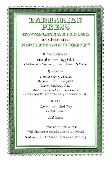
Wayzgoose menu
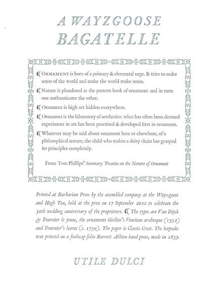
Wayzgoose bagatelle
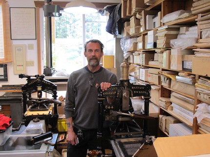
Jason in the pressroom
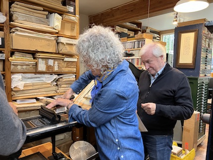
Guests printing
After two months of unrelenting sunshine, as we obsessively checked the predictions day by day for nearly a week in advance the forecast for Saturday, September 17 offered the prospect of rain. The tent would have kept us mostly dry, but the trip back and forth to the pressroom would have been unpleasantly soggy. However, the gods smiled on us, and we awoke to sunny skies and a balmy temperature. Just as the tent people arrived, Apollonia and I dashed into town to pick up the sandwiches, cakes, and other goodies to be arranged on tiered plates designed for the purpose and generously lent to us by the English tart.
We returned to the sight of the white marquee in the garden with tables set out artfully at an oblique angle to one another, laid with tablecloths, colourful paper plates, and a gallimaufry of ceramic mugs, and decorated with small vases of autumn dahlias. Our guests begin to trickle into the garden – some longtime friends, others newcomers to the Barbarian family. Two of Jan’s former students flew in from northern Saskatchewan and Toronto. Several subscribers came from afar: Andy, Chester and Camilla from Toronto; Sara, and John and Patty from California. Stephen, one of our oldest and dearest friends from grad school, made the trek from Oregon, and Scott and Corky, who attended our wedding 50 years ago, drove out from North Vancouver. Our eyes often fell on Apollonia (Polly to us), and our hearts filled with love and gratitude. As Crispin and I looked out at the other faces arrayed at the tables around us, we saw a cross-section of our lives and rejoiced in the richness and continuity of communion, friendship, and work that we have shared. We could not have asked for a happier or more festive day.

Jan and Crispin
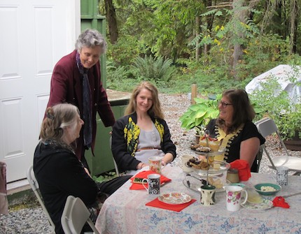
Jan with Wayzgoose guests
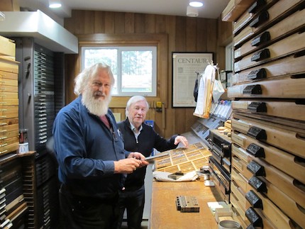
Crispin with Scott
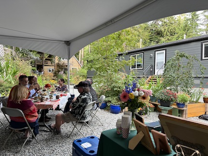
Wayzgoose setting
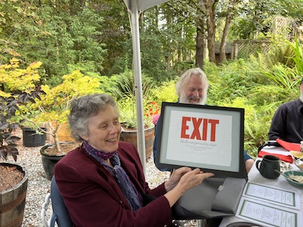
Jan holds up Jason and Caitlin's Wayzgoose present